
A bit of context
I joined the Lucidum team while they already had a product designer but they needed help to move faster, enhance their existing user experience and also implement new features.
In general this is a tool that digest all your data, including users and their assets and then evaluate it to identifies the hidden points and vulnerable areas.
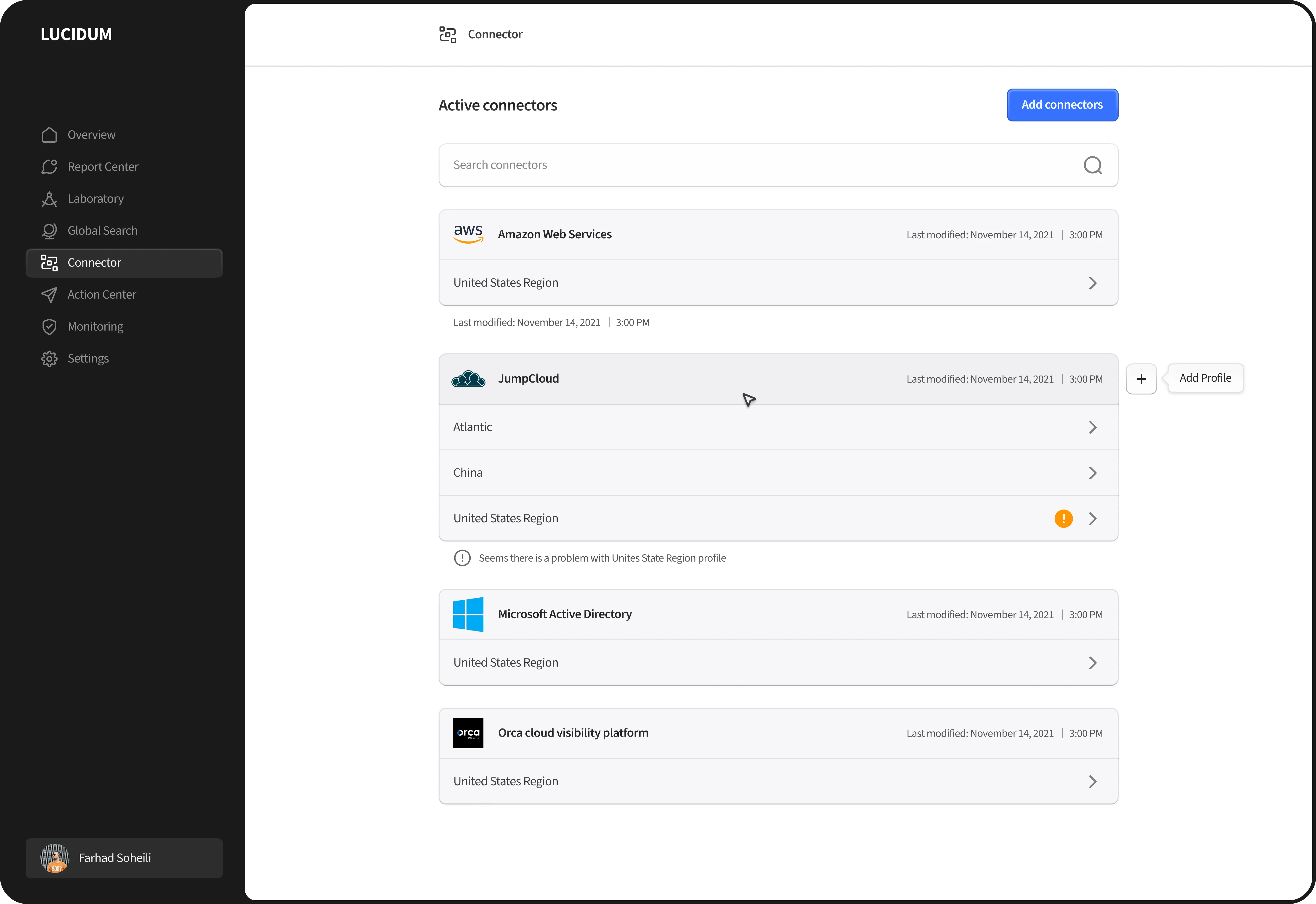
Connector
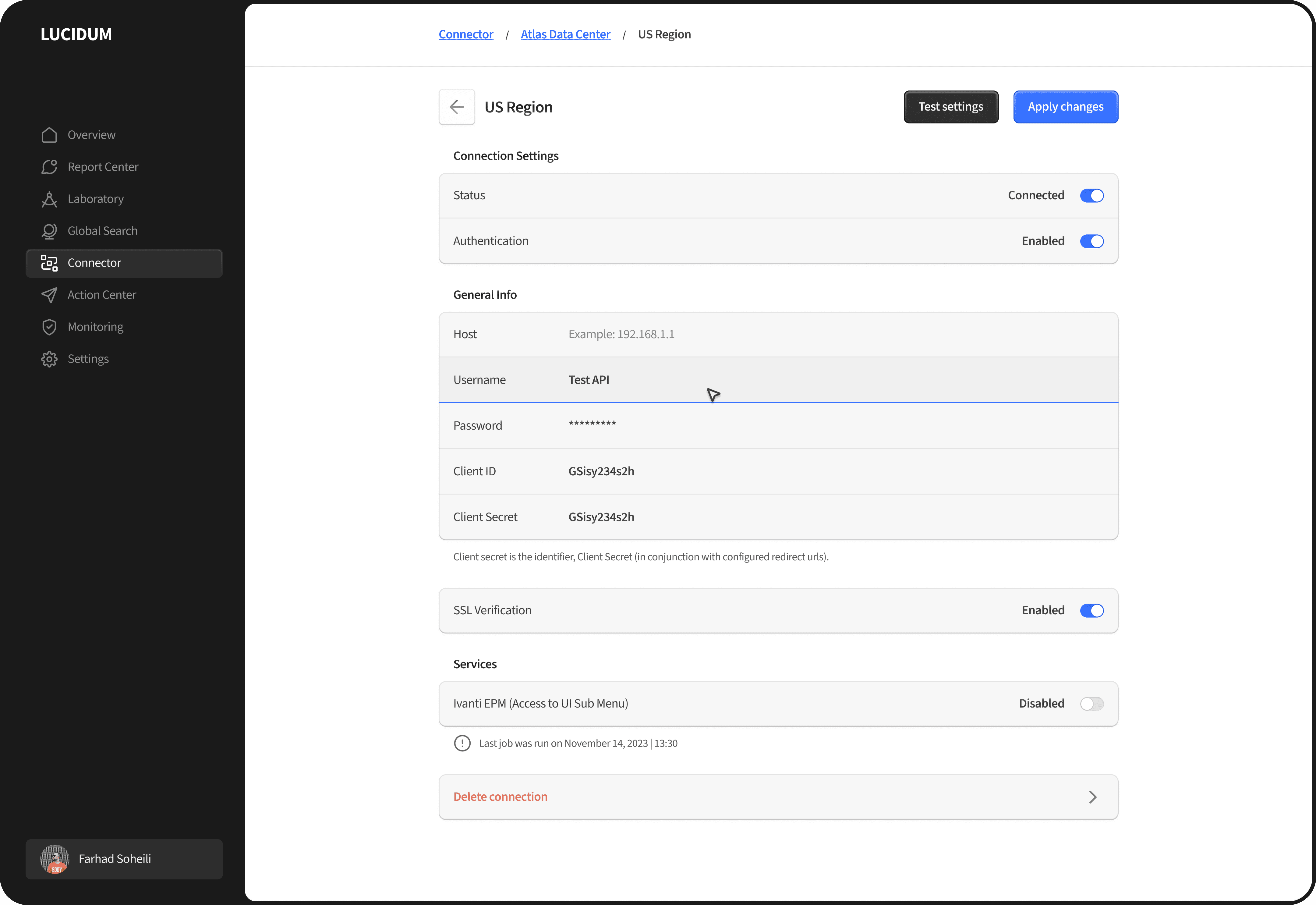
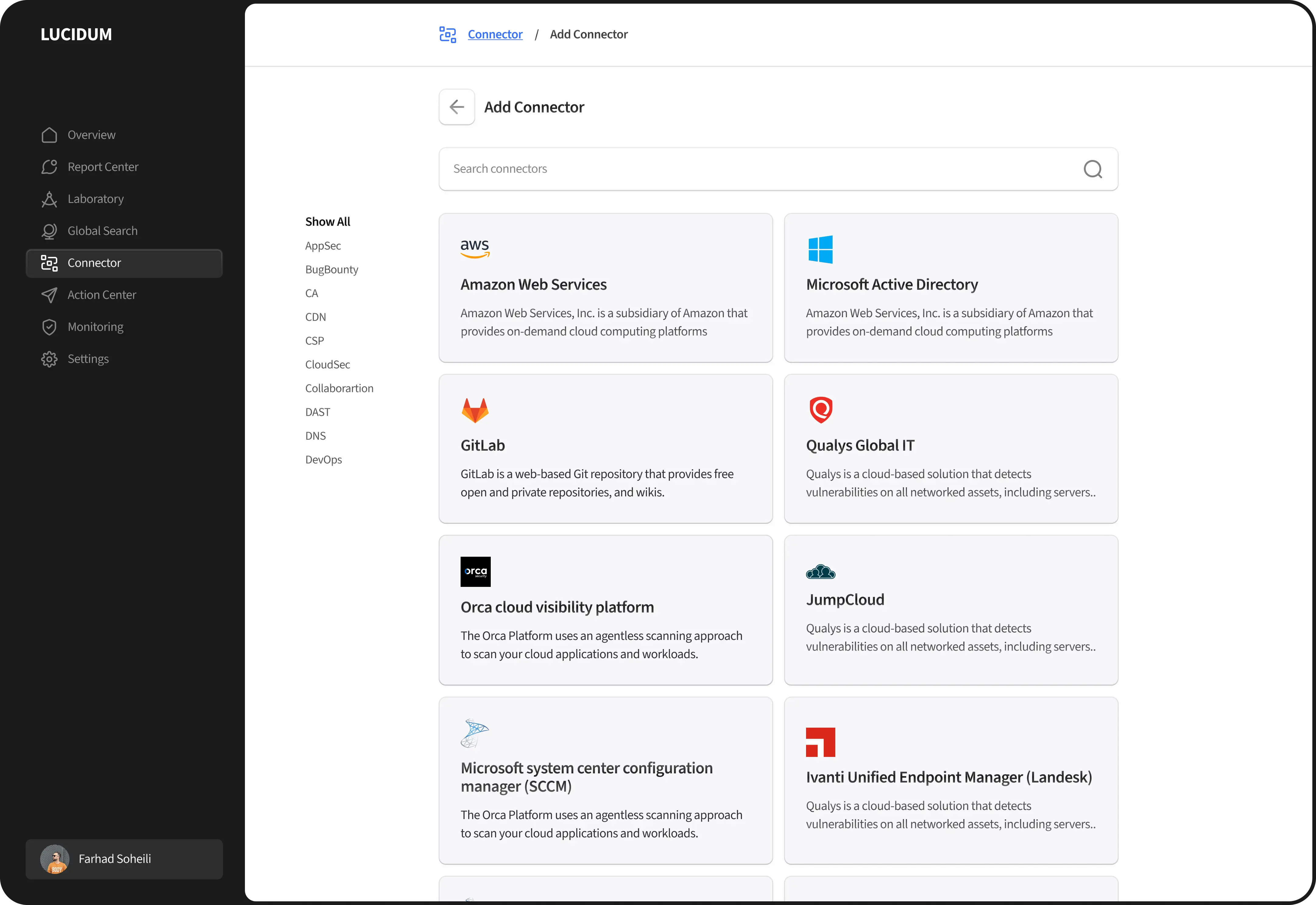
The main part of the this application is connector. Everything else will use the data that will be injected through connectors. From design point of view I had ensure that the users do this stage in the smoothest way. After several iterations I came up with some principles that helped me to keep the screens easy to interact with and also covers all the complex functionalities.
I wanted to keep the UI as simple as possible, so I decided to add extra white space on the edges, then design the main content at the centre of the screen. I could also use the free space on both sides to put secondary content which can be filters, help messages or other call to actions.
One of the changes through the process was the hierarchy of the buttons. Initially we had blue for the primary button and white for the secondary. At some point I realised that we need to have another type between primary and secondary. So I changed the secondary buttons background to a dark grey and used the white background color for the tertiary button.
Action centre
One of the core features of the product was the action centre. This feature lets you connect to external applications and receive notifications and alerts. You first need to set up the integration, then define action trigger. When the action is triggered, you will get notified on the external app.
At this stage, Lucidum were just supporting a few integrations, so we decided to use tabs to make sure that if in the future other third-party apps are added to the supported list, users can easily access their active integrations.
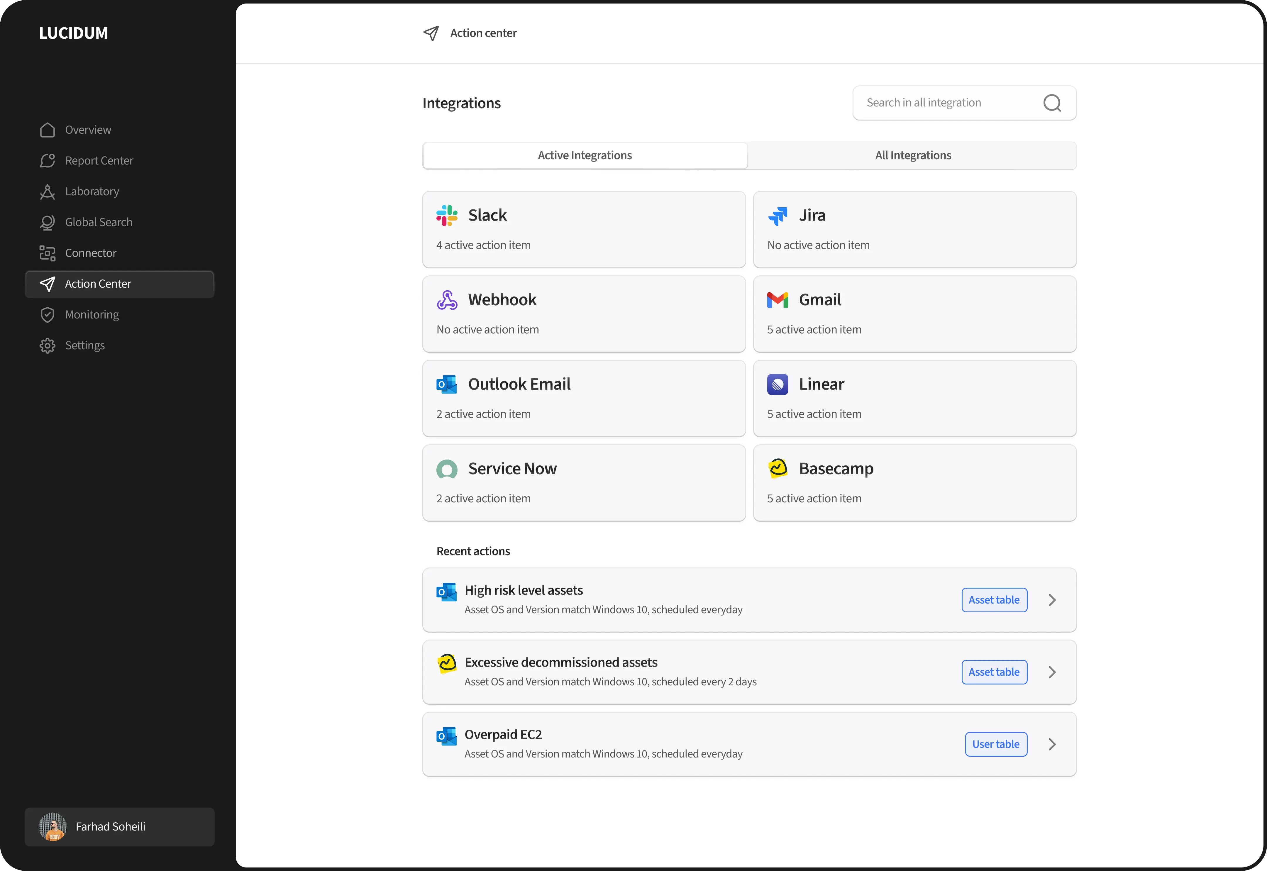
In order to keep the interface as simple and intuitive as possible, I decided to use a single row stack which leads to be placing all the actions and controls below each other.


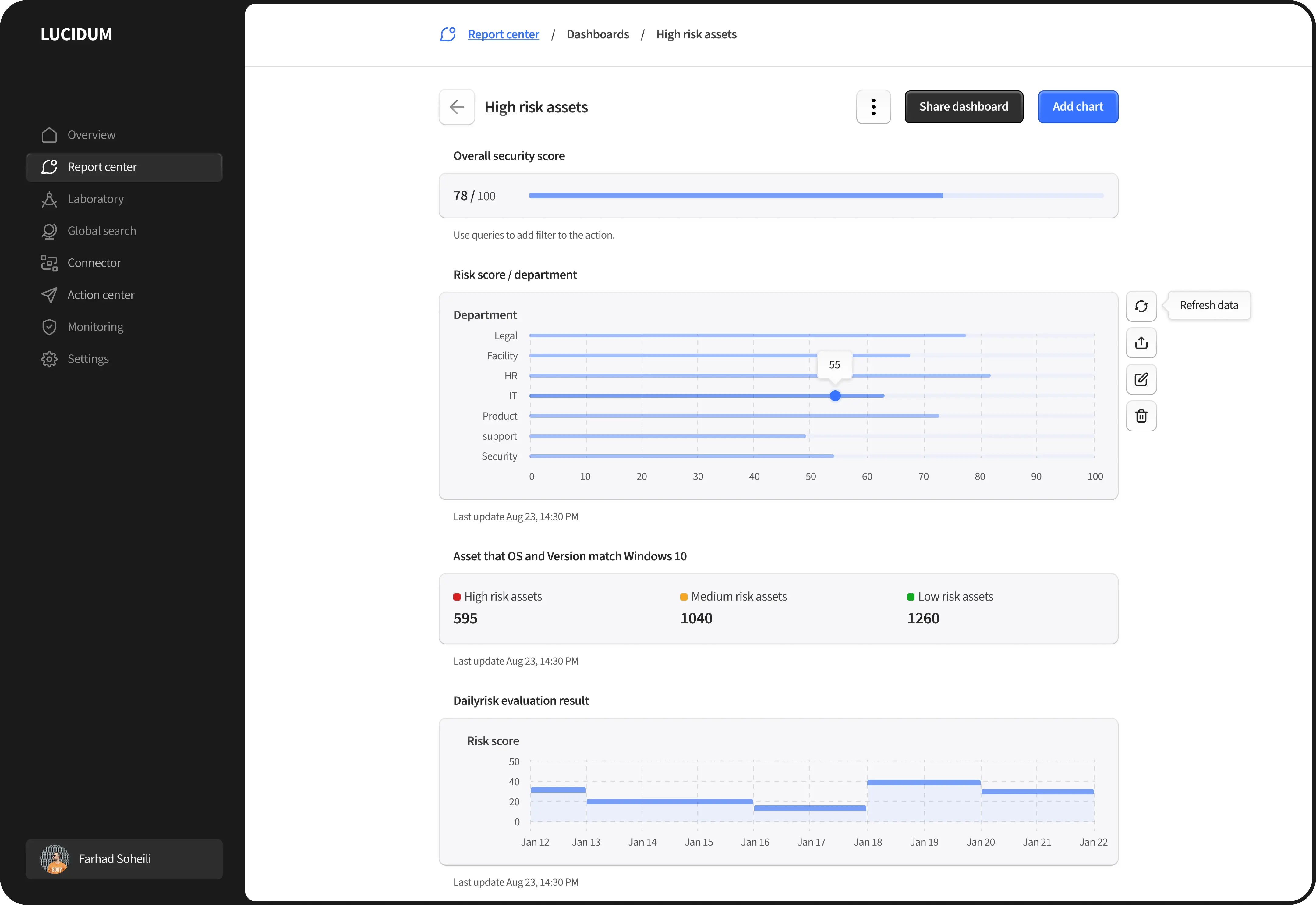
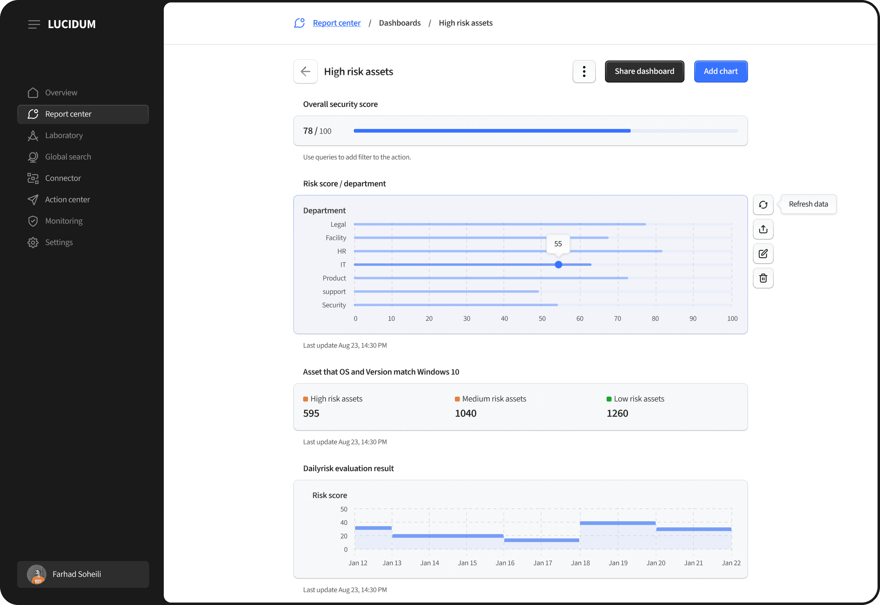
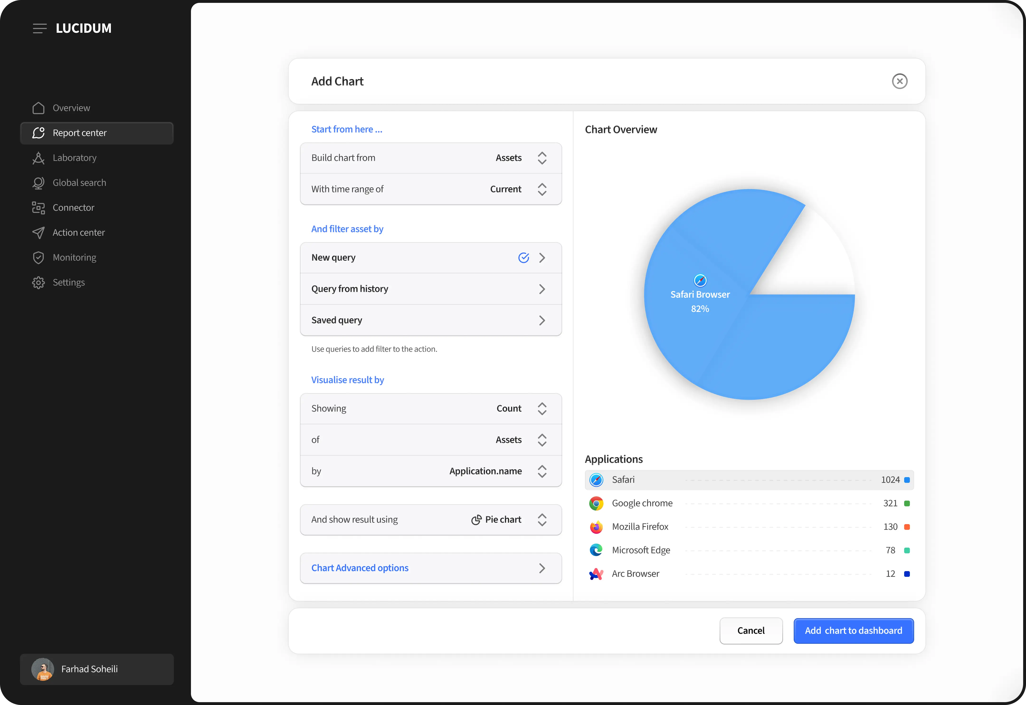
Chart Builder
The other section that redesigned was the chart view. Users can use query builders to collect some data and then use a chart builder to generate charts and put them in a chart view called dashboard.
In this section I also followed the design patterns that we had to keep it consistent. I decided to show all the charts below each other instead of showing them in grids. The reason was that charts are hard to understand sometimes, let alone seeing multiple of the beside each other.
The chart builder was a part that took lots of iterations to reach to a satisfying point for business and also from the UX point of view. To make it easy to digest, I used labels as guidance through users journey in building charts. They could easily understand were the starting point is and what happens next.
What I learned
Sometimes the technical aspects of a product can shape their design, often emphasizing functionality over user experience. As the product designer , one of my main responsibilities was to ensure that despite the project's technical complexity, it would still provide users with a satisfying and easy-to-understand experience.
Senior Product Designer