SPRING UI
Executed a strategic UX redesign for SPRING UI, resulting in
97% user satisfaction and a 4x faster task completion time.
WEB
INTERNAL TOOL
CMS

My Role
UX Lead - Interaction Design, Visual Design, Information Architecture, User Flows, Wireframing, Rapid Prototyping, Problem Solving.
Team
Mauro Murgano, Head of design at WFP
Fabio Fioretti, PMHarini Sekar, UXR
Project Goals and Objectives
The World Food Programme (WFP) uses the SPRiNG UI platform for its Annual Country Reports (ACRs) to showcase global impact. Major usability issues hindered the platform's effectiveness, prompting a strategic UX redesign to enhance the user experience for country offices.
Key problems found
via research.
Low User Satisfaction
Based on the surveys and interviews we found very low user satisfaction (~32%).
Excessive Time Spent on Tasks
Users spent an excessive amount of time completing tasks due to friction points in the workflow.
Final results & impact.
Achieved
97% user
satisfaction
measured by surveys and interviews.
Up to
4x faster
finishing reports
by identifying and addressing friction points in the workflow.
Achieved
30+ new design
patterns
increasing consistency and usability across platform.

After a thorough usability assessment, I categorised the UX issues into two groups: those that could be fixed with minor adjustments and those needing significant changes, such as overhauling the navigation system and information architecture.
Our team adopted a parallel phased approach to address both sets of issues efficiently.
Quick Wins
Addressed minor UX issues rapidly to provide immediate improvements.

Big Changes
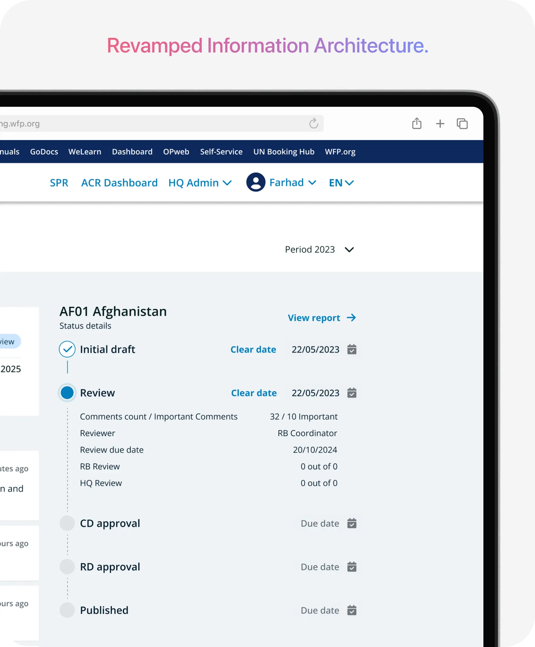
Redesigned the navigation system and information architecture.

Before

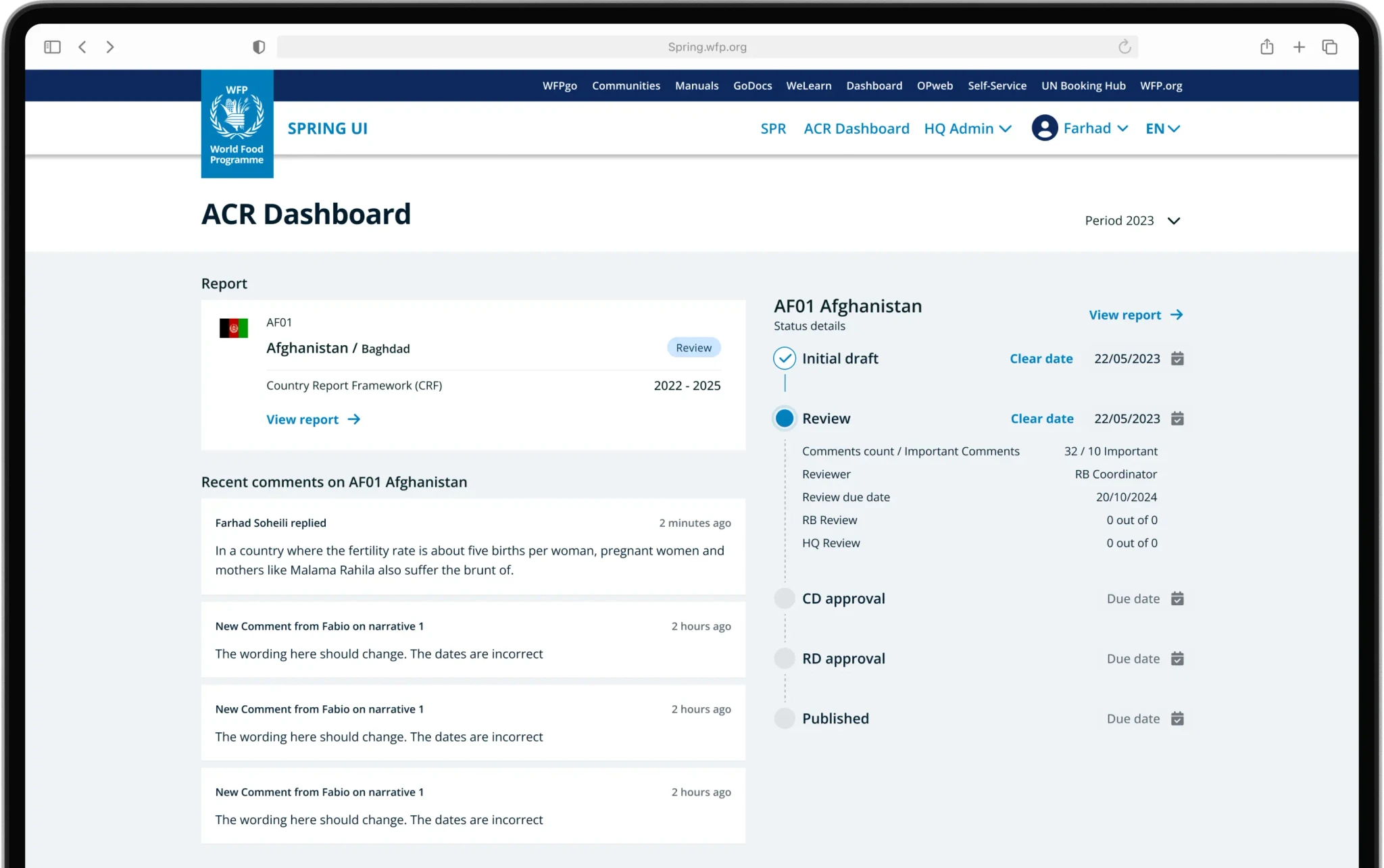
The dashboard's same view for different user roles led to inefficiency and confusion. Editors could only see their country reports, while managers had access to all reports.
Multiple tabs reduced discoverability, forcing users to switch frequently to find status details, resulting in a cumbersome workflow.
After
Specific dashboard
designed for editors.

Achieved
97% user satisfaction
User satisfaction based on the result of user tests and surveys.
Editors can now access all relevant report details, including current state, state detail and number of comments directly within the dashboard. This eliminates the need to navigate through multiple screens and saves valuable time.
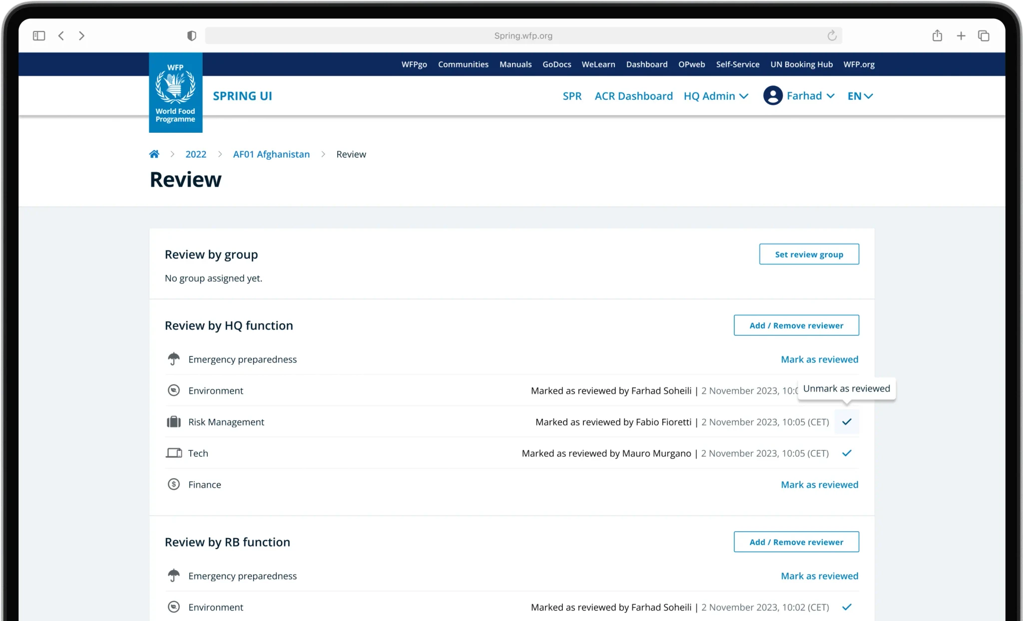
Dashboard
designed for managers.

Up to
5x faster
reviewing reports.
Managers also could preview the reports status in a more effective way due to revamped layout and information architecture.
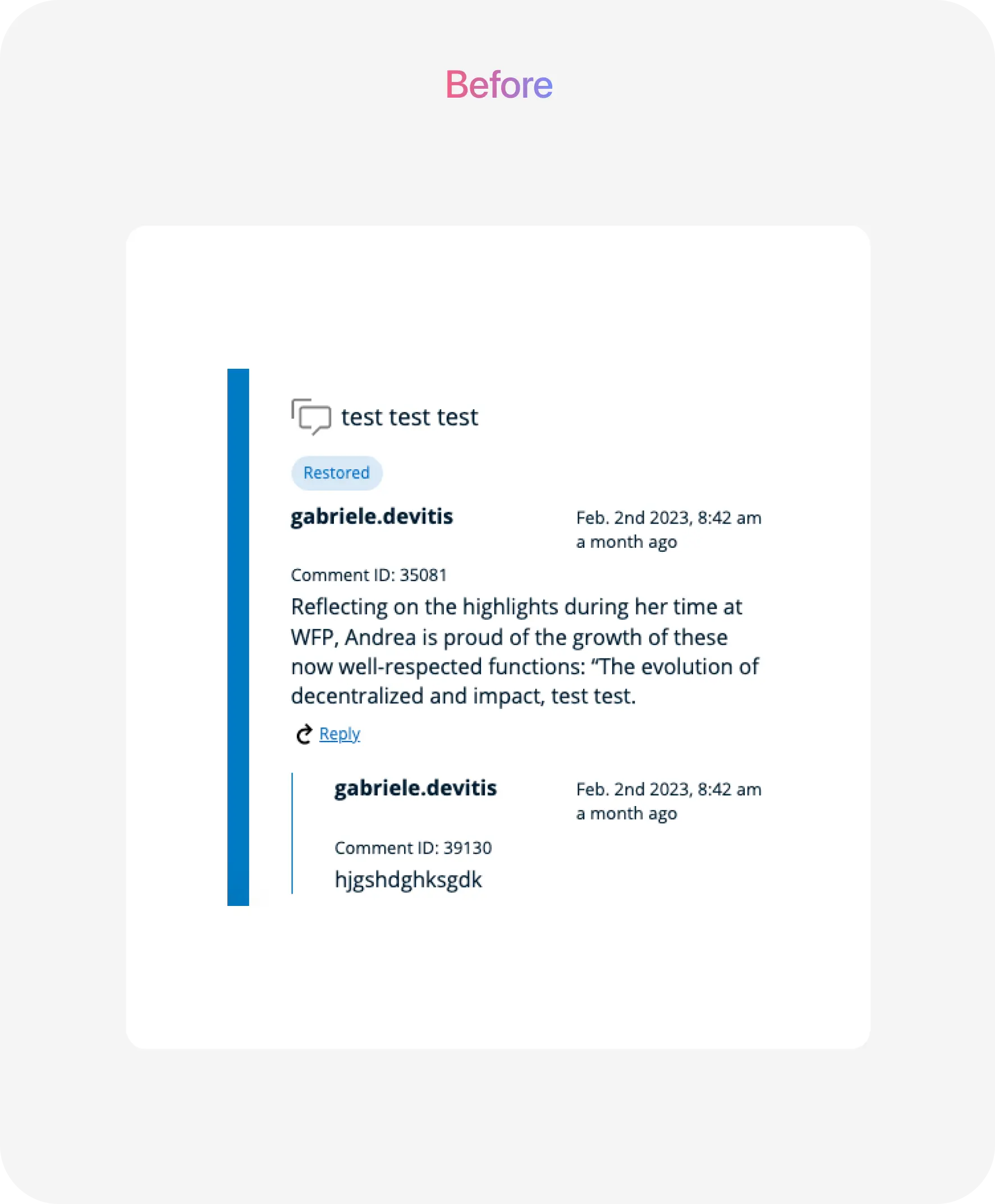
An efficient
commenting system.
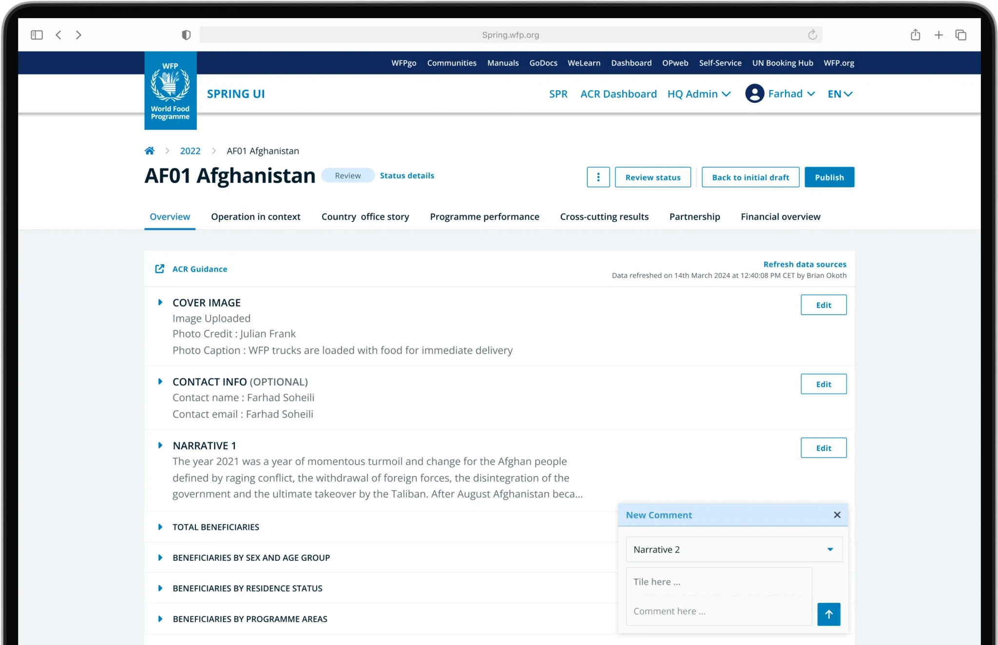
Achieved
95% user satisfaction
User satisfaction based on the result of user tests and surveys.
The new commenting system designed shows significant improvements in usability during test. Editors and managers loved it, specially that now they could tumbled comments panel, yet be able to comment on any part of the report.